VALYRIA
VALYRIA

Client: Valyria (startup)
Project: UI/UX Design and Branding
Product: Responsive Marketing Website
Timeline: June 2021

Valyria, the operating system for investment properties.
THE CHALLENGE.
The client Valyria approached me to redesign their branding and website. The goal was to reposition the brand to a unique & revolutionary positioning, as Valyria’s business concept is a game changer of the “conservative” real state process, converting it into a fully digital process. In addition, sustainability was an other key concept to incorporate into the brand.
Focusing on the target group (investors & sellers), who set up high expectations into the tech and the real state investment sector, brought me to craft a brand and website experience that builds on sophistication and innovation, always keeping an eye on minimalism.
MY APPROACH.
COLLABORATIVE WORK.
The workflow with the client was based on collaborative work and transparent communication with regular design check-ins. During the first phase of the project I worked closely with the Product Manager, and during the implementation phase also with the Engineer.
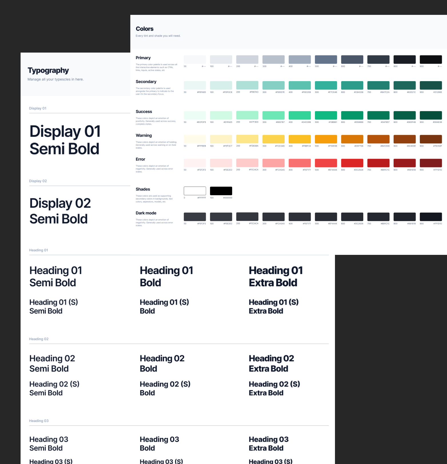
// Color palette
Elegante, innovative and sustainable positioning.
The brand color choice reflects the elegance with the dark petrol blue as primary color, and the sustainability factor with the vibrant green as accent color. Adding white and light gray, this harmonic color combination allowed me to create this unique brand universe for the website. The colors guarantee an accessible contrast, offering flexibility also across the Product Design of the clients app.

// Typography
Boost the brand personality.
The font “Surt” in bold for titles & text highlights provides personality to the brand, and boost the brand image to a next level. The font “Inter” used for paragraphs and descriptions is clear, gentle and versatile.

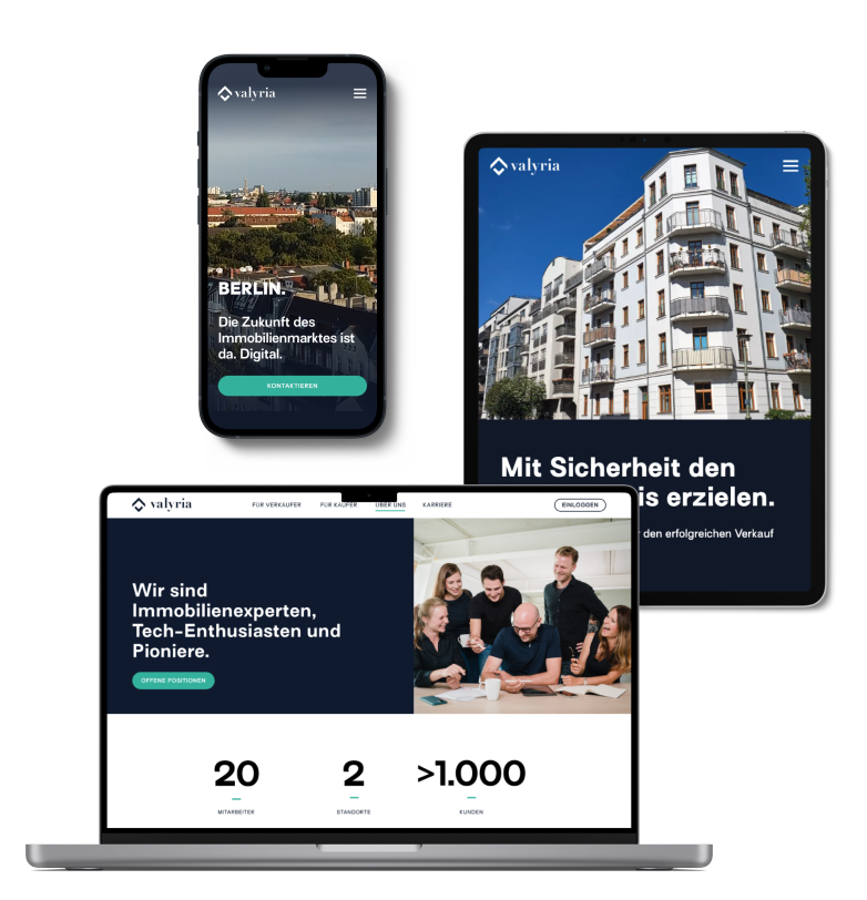
// Responsive UI/UX Design
Sophisticated and minimalistic.
Lots of contrast and white space is used across the digital product design to invite the user to scan quickly and understand Valyria’s services. Overloaded screens produces on users certain anxiety about complex technical details, so a clean and minimalistic design approach reduces this enormously. All screens have been designed under a desktop-first approach, and are adapted for mobile and tablet.
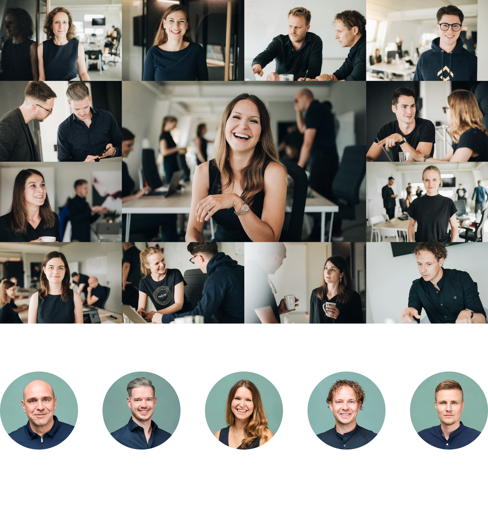
// Imagery
Coherent and professional.
In the scope of this project I also convinced the client to book a professional photo-shooting to present the team members as professional as they are. I set up guidelines of how the photos should be taken: natural and professional, with high contrast and coherent with the brand colors.
// Prototype
Preview for Stakeholders presentations.
I created the prototype to show designs to Stakeholders for approvals. For Developer handoffs I also like to include prototypes to show the flows and connections between screens, as well as forecast planned micro interactions.
Hit the play button to see the recording of the prototype
// Design System
Optimize design and development workflows.
I set up colors, typography scale, icons, grids and components like buttons, navigation bars, cards, ... into a customized Design System, for faster workflows for design and engineering.
Interested in a similar project?
Then reach out to me!
🚀 Let’s boost your business together!